NEXOVISION
A next-generation automation studio for startups and modern companies. Nexovision builds intelligent workflows, AI-powered assistants, and integrated systems that replace repetitive manual tasks. The focus lies on efficiency, scalability, and creating digital infrastructures that allow young businesses to grow faster with less effort.
A next-generation automation studio for startups and modern companies. Nexovision builds intelligent workflows, AI-powered assistants, and integrated systems that replace repetitive manual tasks. The focus lies on efficiency, scalability, and creating digital infrastructures that allow young businesses to grow faster with less effort.
A next-generation automation studio for startups and modern companies. Nexovision builds intelligent workflows, AI-powered assistants, and integrated systems that replace repetitive manual tasks.
Challenge
Challenge
Challenge
Nexovision needed a brand identity that felt young and modern while still expressing the intelligence and credibility of a smart tech/AI company. As a newcomer in a crowded automation market, the startup had to clearly differentiate itself—especially by focusing on early-stage founders and startups without existing CRM or workflow systems.
Additionally, the project required a targeted market analysis and the creation of an investor-ready pitch deck to position Nexovision as a scalable, high-potential solution.
Work To Do
Work To Do
Work To Do
Research
Brand Development
Pitchdeck
Brand Strategy
Research
Brand Development
Pitchdeck
Brand Strategy
Research
Brand Development
Pitchdeck
Brand Strategy
the Name.
the Name.
the Name.
Nexovision represents intelligent connection: systems, data, workflows, and decisions coming together to create clarity and momentum for growing companies.
Nexovision represents intelligent connection: systems, data, workflows, and decisions coming together to create clarity and momentum for growing companies.
Nexovision represents intelligent connection: systems, data, workflows, and decisions coming together to create clarity and momentum for growing companies.
NE·XO
NE·XO
NE·XO
from lat. Nexus
the point where everything connects
from lat. Nexus
the point where everything connects
from lat. Nexus
the point where everything connects
VI·SI·ON
VI·SI·ON
VI·SI·ON
from lat. Visio
the ability to see what's ahead
from lat. Visio
the ability to see what's ahead
from lat. Visio
the ability to see what's ahead
the
SYMBOL.
the SYMBOL.
the SYMBOL.
It isn’t just a letter – it’s a symbol for what Nexovision does:
a nexus, where systems and workflows intersect
a node, a hub where decisions are made
a multiplier, turning small inputs into exponential outcomes
the unknown, which AI helps reveal and define
a crossing point, where a startup’s vision becomes execution
an action marker, the place where things finally run
The X is highlighted because it carries the entire meaning of the brand:
connection, clarity, execution, intelligence.

the Colors.
the Colors.
the Colors.
The color palette blends trust, clarity, and modernity.
The vibrant blue stands at its core — professional yet fresh, breaking away from the typical deep navy of the real-estate world.
It brings a creative, forward-thinking energy, balanced by soft neutrals and dark contrasts for a timeless, digital feel.
the Brand Universe.
the Brand
Universe.
the Brand Universe.
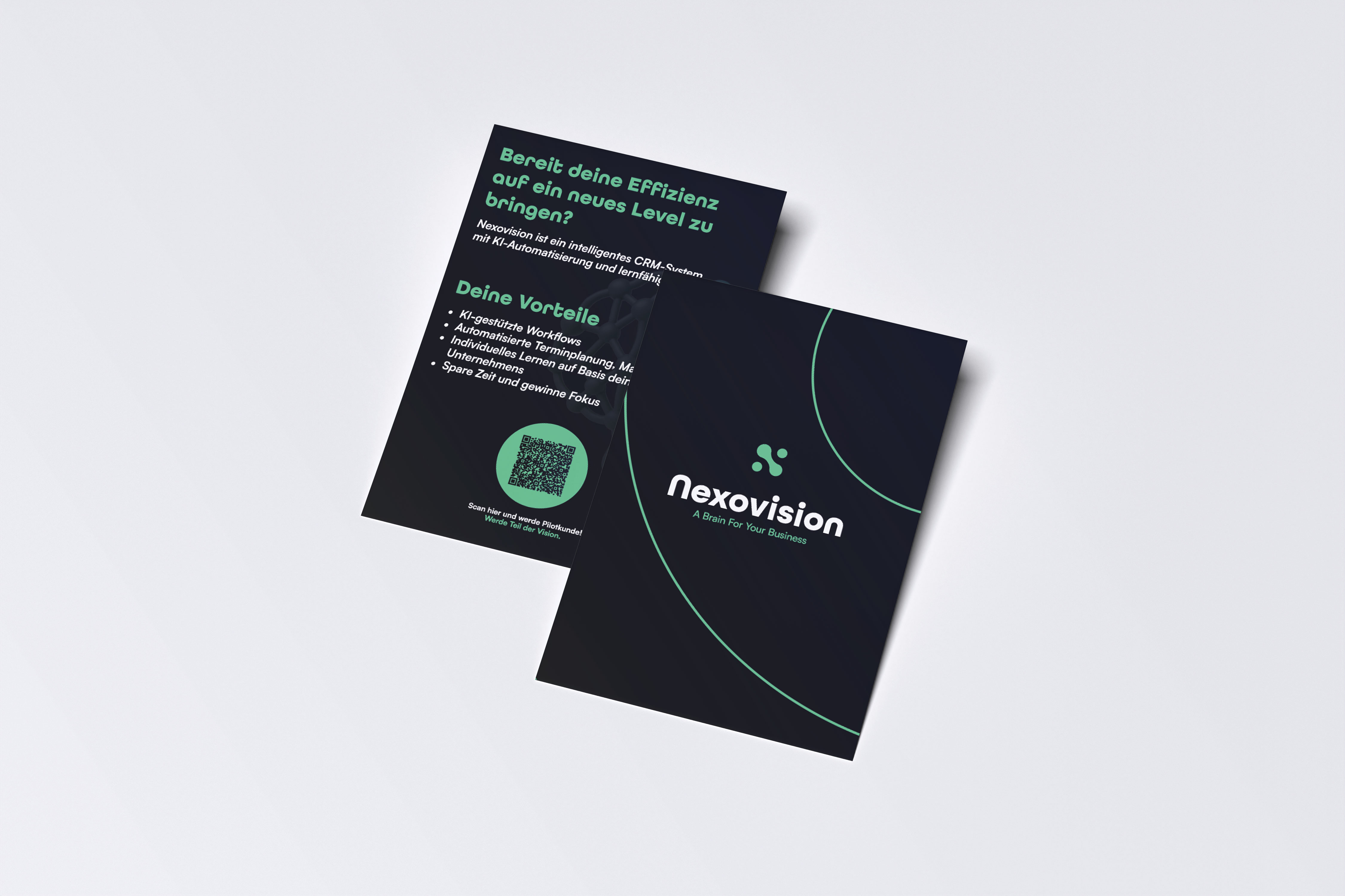
The Nexovision identity was built to feel intelligent, precise, and ready for scale.
Its connected X-symbol reflects systems, automation, and the invisible structures that help modern companies grow.
The visual language blends technology with strategy — clean enough for corporate environments, but sharp enough to feel next-generation.
Across every touchpoint, the brand feels focused, systematic, and built for the future.


CONTACT
CONTACT
© 2025 konstantinfluence. All rights reserved.
© 2025 konstantinfluence. All rights reserved.