
JOURNAL / FIELD NOTES
Not every outdated brand needs a complete rebrand. Learn when a focused refresh is enough—and when strategy, positioning and identity need to change.
Konstantin Nikolaev
Leipzig, Germany
5 min read

Not every outdated brand needs a complete rebrand. Sometimes it just needs to grow up.
This is one of the most common misunderstandings around branding. A company notices that its website feels old, the logo no longer looks quite right and competitors suddenly seem more polished. The immediate reaction is often: We need a rebrand.
Maybe. But maybe the brand itself is still working perfectly fine and only the expression around it has become outdated.
That is the difference between a brand refresh and a rebrand.
A refresh improves what already exists. A rebrand changes the underlying direction.
Understanding which one you actually need can save a lot of time, money and unnecessary reinvention.
Brand refresh | Rebrand | |
|---|---|---|
What changes | The expression: logo refinement, typography, color, layouts, motion | The direction: audience, positioning, messaging, then the identity |
When it fits | The business is the same, only the look has aged | The business, audience or positioning has changed |
The risk | Staying cosmetic when the real problem runs deeper | Throwing away recognition you could have kept |
In one sentence | “We know who we are. We just need to express it better.” | “Who we are has changed, and the brand needs to change with us.” |
What is a brand refresh?
A brand refresh keeps the core identity recognizable but modernizes the way it is expressed.
The logo might be refined rather than replaced. Typography could change. The color palette might become more focused. Photography, layouts, motion and digital applications might be completely redesigned while the central brand remains familiar.
Think of it as renovating a good building.
The structure still works. You are not demolishing it. You are improving the materials, fixing what has aged badly and making the space fit the way people use it today.
A refresh makes sense when customers already know and trust the brand, but the visual identity no longer reflects the quality of the business. Maybe the company grew significantly while its design still looks like an early startup. Maybe the logo is fine, but everything around it has become inconsistent. Or maybe the brand was created before websites, social media and motion became such important parts of the experience.
In those cases, throwing everything away can actually destroy valuable recognition.
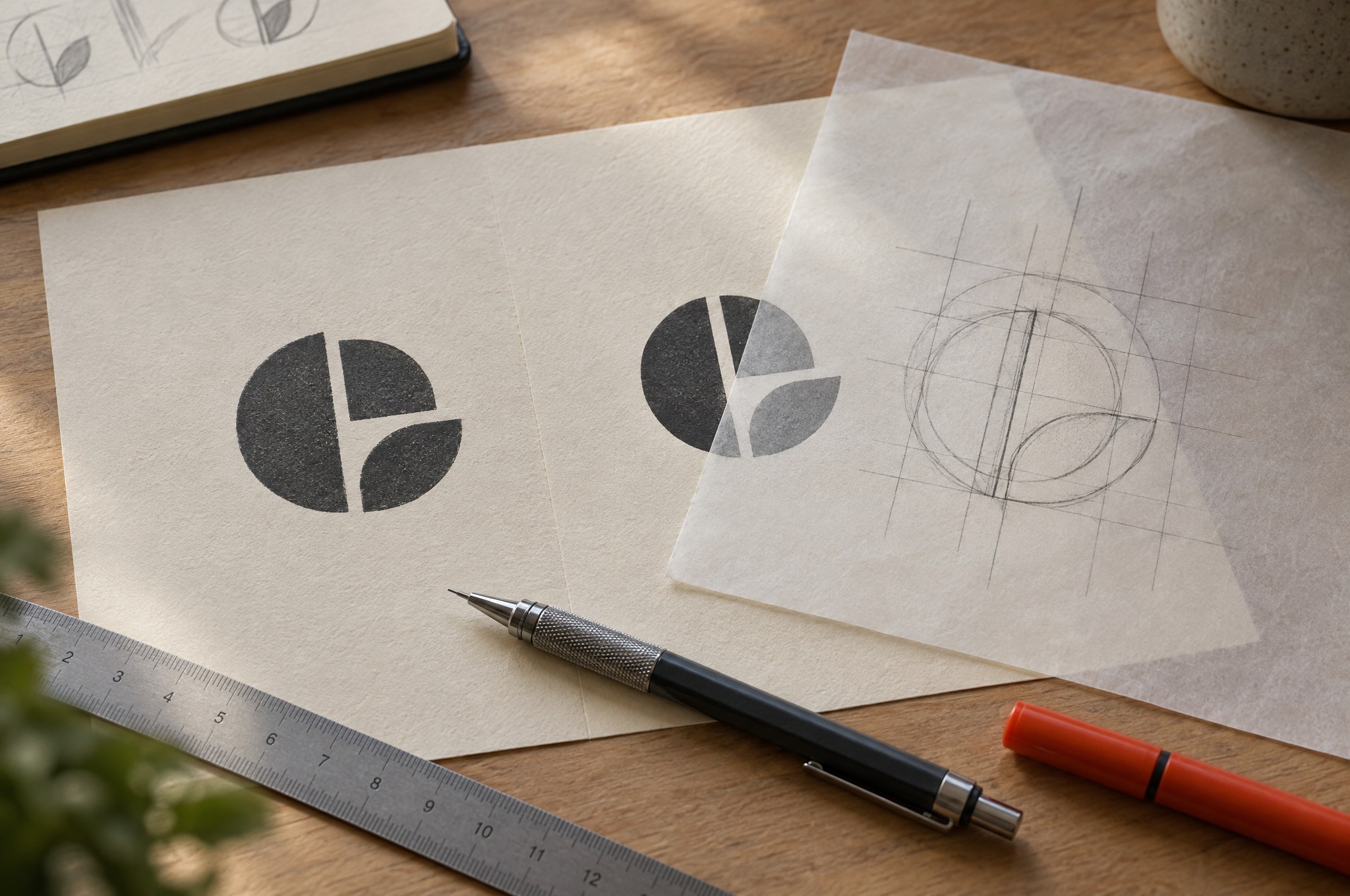
REFINE THE SIGNAL. A refresh improves proportion, typography and application while keeping the mark recognisable. Visual by Konstant Influence.
When do you need a real rebrand?
A rebrand becomes necessary when the problem is deeper than visual polish.
Maybe the business changed its target audience. Maybe the company moved into a completely different price category. Maybe the original positioning no longer makes sense. Maybe two companies merged. Maybe the brand has become strongly associated with something the business no longer wants to represent.
At that point, changing the typeface is not enough.
A real rebrand often goes back to questions like:
Who are we now?
Who are we trying to attract?
What makes us different?
What do we want people to associate with us?
The visual identity comes afterwards.
That is why a rebrand is usually more strategic than a refresh. You are not simply asking how the brand should look better. You are questioning what the brand should stand for in the first place.

STRATEGY BEFORE SYMBOLS. A real rebrand moves from audience and positioning to architecture, messaging and only then identity. Visual by Konstant Influence.
The danger of changing too much
Designers naturally like new things.
New logo. New typography. New colors. New everything.
But brands are not design exercises. Recognition has value.
If customers already associate a certain color, shape or visual characteristic with your company, removing it simply because it feels slightly old can be a mistake. Familiarity is difficult to build and surprisingly easy to destroy.
This is why some of the strongest refreshes feel almost obvious afterwards. The brand looks sharper and more contemporary, but you can still recognize where it came from.
The goal is not always transformation.
Sometimes the smartest move is to identify the parts people already remember and make those parts stronger.

KEEP WHAT PEOPLE REMEMBER. The new identity still leads with the host’s face, the red and the familiar name — the assets listeners already recognise. View the case
The opposite problem: refreshing something that needs to change
Companies can also be too cautious.
They adjust the logo slightly, introduce a nicer font and redesign the website, but underneath it all the same fundamental problem remains.
The company still looks like it serves the audience it had ten years ago. The messaging no longer matches the product. The visual identity communicates cheap and accessible while the company is trying to move premium. Or the brand has expanded so much that nobody really understands what it stands for anymore.
That is when a refresh becomes cosmetic.
You can make the surface look better without solving the reason the brand stopped working.
A simple way to decide
Ask yourself one question:
Has the business changed, or has only the way it looks become outdated?
If the business, audience and positioning are still essentially the same, a refresh may be enough.
If the company itself has changed significantly, a rebrand becomes much more likely.
Another useful test is to imagine removing your current visual identity completely. Would you still describe the company in exactly the same way? If yes, you probably do not need to rebuild the strategy from zero. If the answer has changed dramatically, the identity may need to change with it.
Your website usually reveals the problem first
Websites have a habit of exposing weaknesses in brands.
A logo that worked perfectly on packaging might suddenly feel awkward in navigation. A color palette designed around print may not work well for digital interfaces. The brand might have no motion language, no clear typography system and no idea what photography should look like.
That does not automatically mean the brand is broken.
It may simply mean the identity was never developed far enough.
This is why many website redesigns slowly turn into brand refreshes. Once you begin redesigning the digital experience, you realize that the website is not the problem. The website is just revealing inconsistencies that were already there.

THE WEBSITE IS THE STRESS TEST. On lookz.app, the identity has to work as a type system, a colour logic and a motion language at the same time. View the Lookz case
Rebrand or refresh?
A refresh says:
“We know who we are. We just need to express it better.”
A rebrand says:
“Who we are has changed, and the brand needs to change with us.”
Both can completely transform how a company is perceived.
The important part is not choosing the more dramatic option.
It is solving the right problem.
Because sometimes a brand does not need a new identity.
It simply needs to become a better version of the one people already know.

Written by
Konstantin Nikolaev
Brand & Web Designer
Brand & web designer based in Leipzig and Halle (Saale), and an Official Framer Expert. I build brand identities and websites that work as one system.
WRITTEN FROM
Leipzig, Germany


