JOURNAL / FIELD NOTES
How I connect strategy, typography, colour, imagery and motion into a distinctive brand universe—and bring it to life through the website.
Konstantin Nikolaev
Leipzig, Germany

Most clients don’t come to me because they need a new logo. They come because their brand no longer feels as good as the business actually is.
Maybe the company has grown, but the identity still feels small. Maybe the website looks polished, but generic. Maybe the brand works in one place and completely falls apart in another. Or maybe everything looks technically fine, but there is no real feeling, no consistency and nothing people remember.
That is usually where the real work starts. Because the solution is rarely one new asset. It is about creating a complete visual world in which the logo, typography, color, imagery, language and motion all reinforce the same idea.
That is what I mean when I talk about building a brand universe. The goal is not simply to make a company look better. It is to make it feel more coherent, more distinctive and more like the business it wants to become.
It starts before the design
Before choosing fonts or opening Figma, I want to understand what the brand is actually supposed to become.
Who is it trying to attract? What should people feel when they first encounter it? Where does it sit between premium and accessible, serious and playful, familiar and unusual? And most importantly: what should make it feel different from the companies around it?
I find these tensions much more useful than generic words like modern, professional or innovative. Almost every company wants to be modern and professional. Those words rarely tell you how something should actually look.
Something like “premium, but never formal” already gives you much more direction. Suddenly you can begin making decisions. A very traditional luxury aesthetic might feel too stiff. Something overly playful might feel too casual. The interesting space is somewhere between those two extremes.
That space becomes the foundation of the universe.
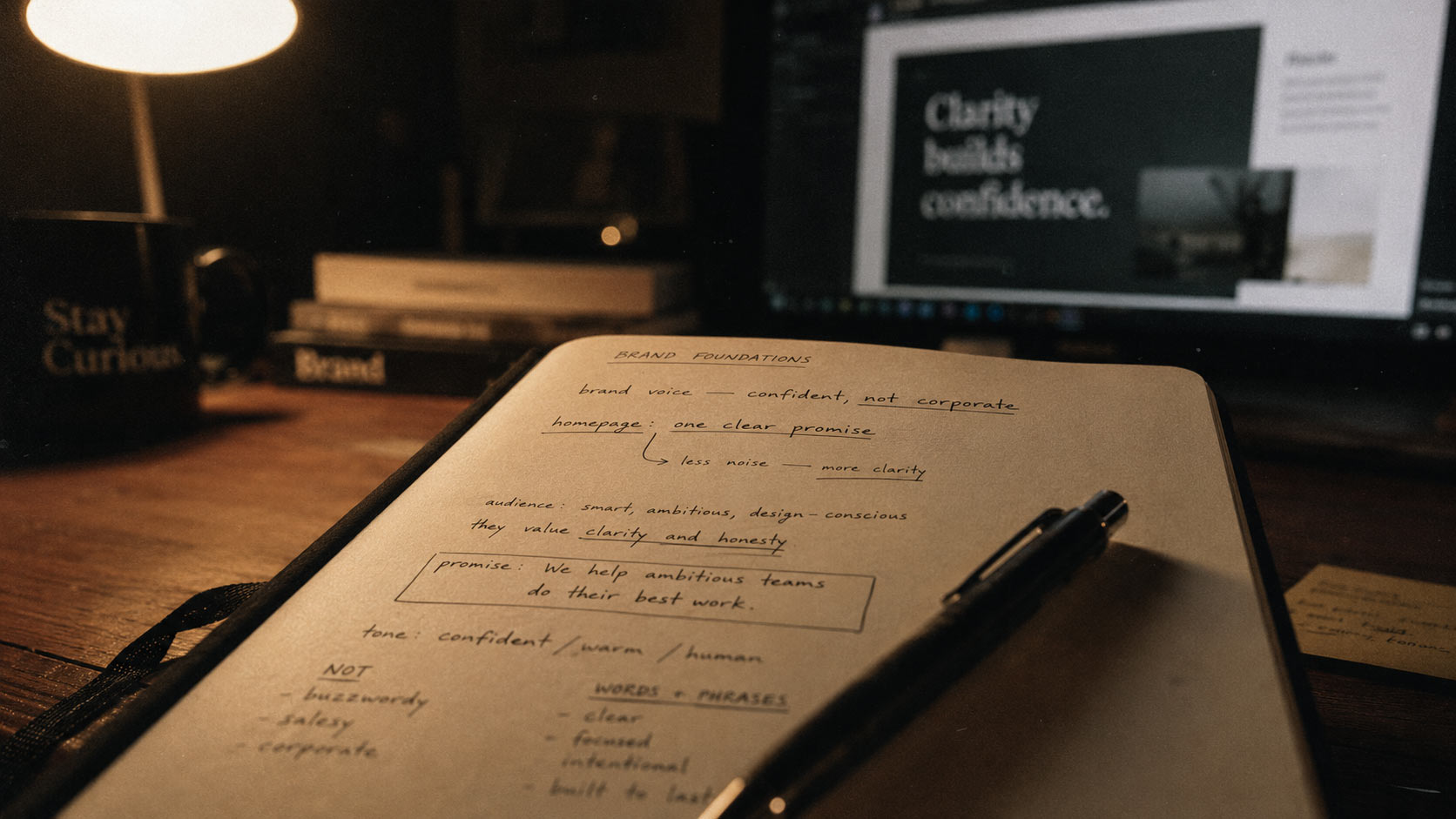
DIRECTION BEFORE DESIGN. Audience, tone and positioning give the visual decisions a purpose. Process illustration from Konstantinfluence
Then the visual language starts to form
The logo is part of this process, but I do not think it should carry the entire identity.
Sometimes the logo is the loudest element. Sometimes it is intentionally simple because typography, imagery or motion create most of the personality. What matters is how everything behaves together.
A serif typeface can add sophistication while a raw sans-serif keeps the identity contemporary. A very restrained palette can make one accent color much more powerful. Clean layouts can become more interesting when one graphic element deliberately breaks the system.
These relationships are where the identity starts developing character.
The question stops being:
“Does this font look good?”
and becomes:
“Does this font belong in this world?”
That difference sounds small, but it changes the entire design process.
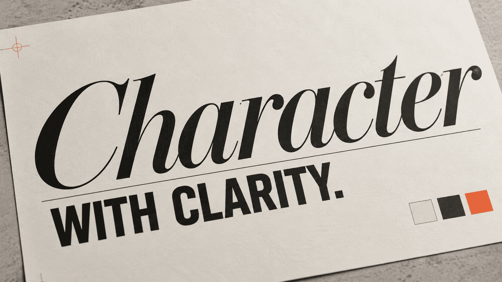
CONTRAST WITH A PURPOSE. A refined serif brings character; a bold sans-serif adds clarity. Illustrative type study by Konstantinfluence.
A good system needs rules — but also room to breathe
Brand consistency is important, but I do not think every piece of communication should look identical.
If every Instagram post, presentation and website section follows exactly the same template, the brand may be consistent, but it also becomes predictable.
A strong system should be recognizable without constantly repeating itself.
I think of it more like a language. There are rules, but you can still create thousands of different sentences. The typography behaves in a certain way. Colors have specific relationships. Photography follows a certain feeling. Motion has its own rhythm. Once those rules are clear, you can experiment inside them without losing the identity.
That is when a brand becomes useful rather than restrictive.

SAME LANGUAGE, DIFFERENT SCALES. Backdrop, banners and counter share the Nexovision identity while serving different roles. View the Nexovision case
The website is where the universe becomes real
This is probably my favourite part of the process. A brand presentation can make an identity look great because everything exists inside controlled mockups. A website is less forgiving.
Suddenly the typography needs real hierarchy. Colors need functional roles. Images have to work across different screen sizes. Motion needs timing and purpose. Buttons, navigation, forms and long sections all have to feel like they belong to the same company.
The website becomes a stress test for the identity.
And often, this is where new parts of the brand emerge. Maybe a motion behaviour becomes recognizable. Maybe a certain layout principle develops. Maybe the way headlines interact with imagery becomes something the company can reuse elsewhere.
The digital experience does not simply apply the brand. It can expand it.
This is why I do not separate branding and web design too aggressively
For digital-first companies, the website may be the most important expression of the brand.
It is often the first place where someone actually experiences everything together: the strategy, visual identity, language, imagery and movement.
That is why designing the identity in isolation and handing it over to someone else to “put on a website” can sometimes feel disconnected. The identity looked great in the brand deck, but once it reaches the actual product, something disappears.
I prefer thinking about the transition much earlier.
How will this typography behave on a screen? What does the brand look like in motion? What happens when the logo is not visible? Can the identity still feel distinctive after twenty different pages?
Those questions make the branding stronger before the website even begins.
The goal is recognition without repetition
A finished brand universe should eventually make decisions easier.
You should be able to look at a photograph and know immediately whether it belongs. You should know what kind of headline sounds right. A designer should be able to create a new page without reinventing the visual direction from zero.
That does not mean everything becomes predictable. It means the brand has developed its own logic.
The logo identifies the company.
The typography gives it a voice.
The imagery creates atmosphere.
The motion gives it energy.
The website brings everything together.
And once all of those elements begin reinforcing each other, the brand starts feeling bigger than any single asset.
That is when an identity stops looking like a design system and starts feeling like a world.
Konstantin Nikolaev
Brand & Web Designer
WRITTEN FROM
Leipzig, Germany


