JOURNAL / FIELD NOTES
Premium branding is not a beige visual formula. It is the perception created by confidence, consistency, detail, distinctiveness and an experience that keeps its promises.
Konstantin Nikolaev
Leipzig, Germany

Making a brand look expensive is surprisingly easy. Making it actually feel premium is much harder.
Use a serif typeface. Add lots of whitespace. Make everything black, white and beige. Put the product on a marble surface. Slow down the animations.
You now have something that looks vaguely luxurious.
The problem is that thousands of other brands have discovered exactly the same formula.
Premium branding is not a visual style. It is a perception created through dozens of small decisions — and usually through knowing what not to do.
Premium does not mean luxury
A premium brand does not necessarily need to look like a fashion house.
A technology company can feel premium. A restaurant can feel premium. A construction company can feel premium. Even a very colorful or playful brand can feel premium.
What they often have in common is a sense of intentionality.
Nothing feels accidental.
The typography feels chosen rather than downloaded. The imagery belongs to the brand rather than simply filling space. The website has rhythm. The copy knows what it wants to say. The company does not desperately try to convince you how good it is.
You simply get the feeling that someone cared.
That is probably one of the biggest differences between something that feels premium and something that merely looks polished.
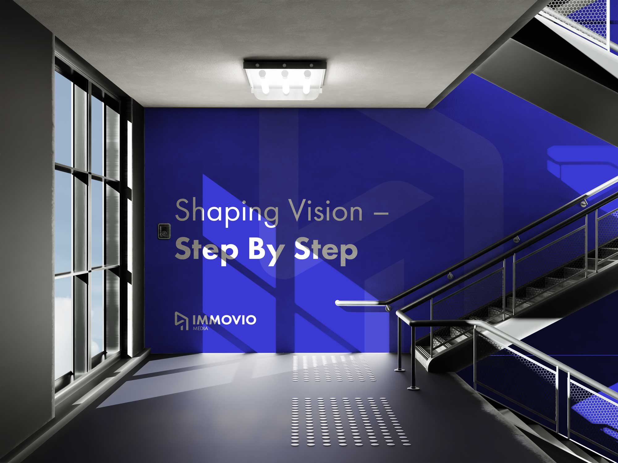
PREMIUM WITHOUT BEIGE. Strong hierarchy and disciplined application can make a vivid technology identity feel considered. View the Immovio case
Confidence is often quieter than you think
Cheap brands tend to over-explain.
Every headline needs three claims. Every section needs another badge. Every button needs urgency. Everything is “industry-leading”, “revolutionary”, “premium” and “best-in-class”.
A confident brand does not need to shout constantly.
It can leave space around a sentence. It can show one great image instead of six average ones. It can remove unnecessary information. It can let a product speak without covering it in promotional graphics.
That does not mean minimalism automatically equals premium.
It means restraint can communicate confidence.
There is a difference between emptiness and intentional space. One feels unfinished. The other feels deliberate.
Consistency creates perceived quality
One beautiful homepage does not create a premium brand.
If the website looks exceptional but the Instagram posts feel random, the presentation deck uses another font and the sales PDF looks like it came from Microsoft Word in 2014, the illusion disappears quickly.
Premium perception is built through consistency across touchpoints.
The same visual logic should survive the website, social media, presentations, packaging, photography and wherever else the company appears. Not because everything needs to look identical, but because everything should feel like it came from the same mind.
This is why a strong brand system matters more than one impressive design.
Anyone can create one beautiful screen.
The harder part is creating a visual language that still feels good on the hundredth one.
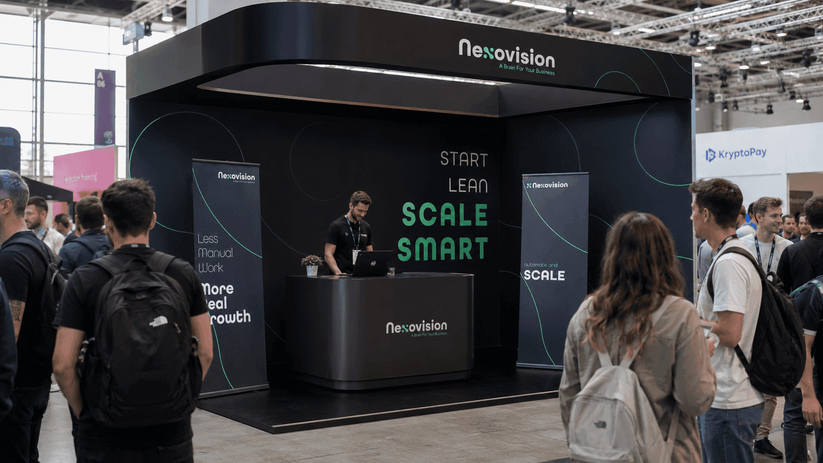
QUALITY SURVIVES CONTACT. The identity stays coherent across the booth, banners and live environment. View the Nexovision case
Details matter — because people feel them before they understand them
Most customers will never consciously analyse the kerning of your logo or the spacing between two sections.
They still feel when something is wrong.
A button that is slightly too large. An animation that feels cheap. Photography with inconsistent lighting. A headline with awkward line breaks. Ten different border radii across one website.
Individually, these things sound insignificant.
Together, they shape perception.
Premium design often works because hundreds of small decisions are aligned. Nothing is fighting for attention. Nothing feels approximately correct.
The same applies outside design. If a beautiful website leads to a badly written automated email, the experience becomes cheaper immediately.
The brand is the complete experience, not the screenshot you post on Behance.
Distinctiveness matters more than decoration
One of the easiest ways to make a brand look less premium is to make it look exactly like every other premium brand.
Elegant serif.
Neutral sans serif.
Cream background.
Editorial photography.
Beautiful? Possibly.
Memorable? Not necessarily.
The strongest premium brands usually have something slightly unexpected inside the system. Maybe the typography is unusually aggressive. Maybe the color palette contains one strange accent. Maybe the photography feels raw while everything else is extremely controlled.
There is tension.
That tension creates character.
A completely perfect brand can sometimes become so polished that there is nothing left to remember.
This is why I like combining very controlled design systems with one element that deliberately breaks them. The system creates quality. The disruption creates personality.
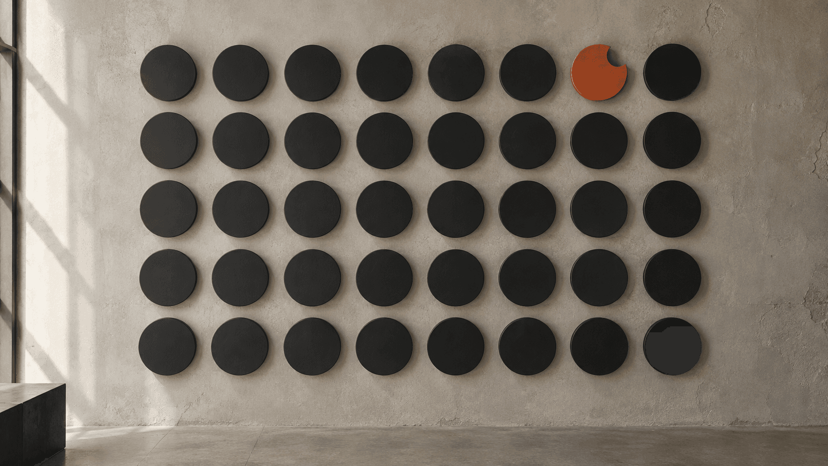
THE SYSTEM CREATES QUALITY. THE INTERRUPTION CREATES MEMORY. One deliberate break can give a controlled identity character. Editorial visual by Konstantinfluence.
Your price positioning has to match the experience
There is also something design cannot solve.
You cannot build a premium brand around a mediocre experience.
If the website communicates exclusivity but the customer receives slow replies, confusing documents and inconsistent service, the visual identity becomes a promise the business cannot keep.
Premium perception is created when everything points in the same direction.
The product.
The service.
The language.
The photography.
The website.
The smallest interaction.
Design can amplify the quality of a business. It cannot permanently replace it.
So what actually makes a brand feel premium?
It is rarely one expensive-looking element.
It is the absence of things that feel accidental.
Clear decisions. Strong hierarchy. Distinctive imagery. Consistent execution. Confident language. Attention to detail. And enough restraint to know when the design is finished.
The goal is not to make people think:
“They used a premium font.”
The goal is that the entire experience quietly communicates:
“This company knows exactly what it is doing.”
That feeling is much harder to fake.
And ultimately, that is what makes a brand feel premium.
Konstantin Nikolaev
Brand & Web Designer
WRITTEN FROM
Leipzig, Germany


