
JOURNAL / FIELD NOTES
A logo identifies a company. A brand identity builds recognition through typography, color, imagery, layout and language—even before the logo appears.
Konstantin Nikolaev
Leipzig, Germany
5 min read

A logo is not a brand. And it isn’t your entire brand identity either. Still, when companies say they need a new brand, what they often mean is that they want a new logo. That distinction matters, because a logo is only one recognizable element. A brand identity is the complete system around it: typography, colors, imagery, layouts, language and sometimes motion. The brand itself goes one step further. It is the perception people build in their heads after experiencing all of those things together.
A simple way to test whether you have a real identity is to remove the logo from your website. Would someone who knows the company still recognize it from the typography, imagery, colors or way the page is designed? If the answer is yes, you probably have an identity. If the answer is no, you may simply have a logo.
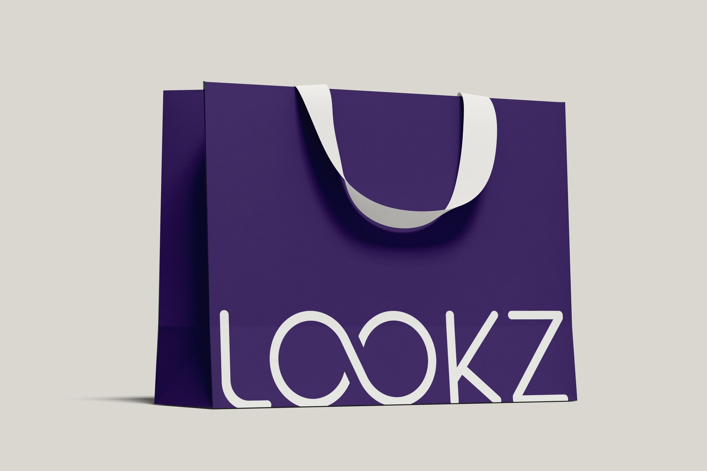
01 — LOGO AS IDENTIFIER. One mark, one surface, one job: say who it belongs to. Lookz identity by Konstant Influence.
A logo identifies. An identity creates recognition.
A logo is the most condensed visual representation of a company. It might be a wordmark, symbol or monogram, but its main purpose is identification. Think of it like a signature. Your signature tells people who you are, but it does not explain your personality, how you dress, how you speak or what it feels like to spend time with you.
This is also why businesses often expect too much from logos. They want them to feel innovative, trustworthy, premium, approachable and modern all at once. But a logo does not need to communicate the entire company. The identity around it can do much more of that work.
A brand identity includes the visual and verbal elements a company uses repeatedly: typography, color, photography, layouts, graphic elements, motion and tone of voice. What matters is not simply having those assets, but how they behave together. Maybe the logo is extremely restrained while the typography is expressive. Maybe the layouts are strict while the photography feels spontaneous. Maybe one bright accent color is used only in very specific moments. Those repeated decisions slowly create recognition.
Logo | Brand identity | |
|---|---|---|
What it is | One mark: a wordmark, symbol or monogram | A system of typography, color, imagery, layouts, language and motion |
Its job | Identification, like a signature | Recognition, even before the logo appears |
It works when | People see it | The same logic holds across every touchpoint |

02 — IDENTITY AS RULES. Typography, color, spacing and imagery turn a mark into a repeatable system — across app, stationery and social.
Consistency does not mean everything should look identical
One of the biggest mistakes in branding is confusing consistency with repetition. If every social post, presentation and page uses exactly the same layout, same background and same logo placement, the brand may technically be consistent, but it quickly becomes boring.
A good identity works more like a language. You can say completely different things while still sounding like the same person. A brand should be able to create different campaigns, different pages and different compositions without losing its character. That is the difference between a template and an actual identity system.
The strongest brands can often be recognized before the logo appears because several signals work together. A certain typeface, a specific color relationship, a particular style of photography or even the way something moves can become recognizable over time. None of those elements has to be completely unique on its own. Distinctiveness often comes from the combination.

03 — IDENTITY IN USE. The system has to work on a lanyard, a card and a counter — not just on a presentation slide.
Why this matters even more now
Today, creating something that looks reasonably professional has become much easier. Templates are better, design software is more accessible and AI can generate logos, images and websites within seconds. The average visual quality is rising, but that also means more brands are beginning to look the same.
Clean sans-serif typography. Muted colors. Minimal logos. Rounded cards. Nice photography. Everything looks good, yet nothing feels especially memorable.
That changes the question businesses need to ask. It is no longer only: “Does our brand look professional?” It is increasingly: “Does our brand have a recognizable point of view?”
A stronger logo alone will not solve that. A company can redesign its mark and still have generic photography, unclear messaging and a website that looks like every competitor. In those cases, the logo was never the main problem.

04 — IDENTITY AS A WORLD. When the same logic carries from objects to campaigns and storefronts, recognition no longer depends on the logo alone. View the Lookz case
The website is where the identity gets tested
This is why branding and web design are so closely connected. A brand presentation can make almost anything look convincing, but a website forces the identity to work in reality. Typography needs hierarchy. Colors need functionality. Images need direction. Motion needs timing. Navigation, buttons and responsive layouts all need to feel like they belong to the same company.
For many modern businesses, the website is also one of the first places where someone experiences the brand. It is where an identity stops being a collection of assets and starts becoming an actual experience.
That is why I prefer thinking about brands as universes rather than logos. A strong brand creates a world with its own visual logic. You begin to understand what belongs inside it and what does not. A certain image feels right. A certain sentence sounds right. A certain animation makes sense. Another one does not.
“
Worth remembering
The logo lives inside that universe, but it does not have to carry the whole thing.
The easiest test
Open your website and cover the logo.
Then scroll.
Would it still feel unmistakably like your company?
If yes, you probably have a visual identity.
If not, that might be the more interesting problem to solve.
Because the real goal is not simply to become recognizable when people see your logo. It is to build a brand people can recognize before they even need to see it.

Written by
Konstantin Nikolaev
Brand & Web Designer
Brand & web designer based in Leipzig and Halle (Saale), and an Official Framer Expert. I build brand identities and websites that work as one system.
WRITTEN FROM
Leipzig, Germany


